Magil Construction,
Environmental & Fleet Branding
Scaling corporate visibility from mobile assets to job-site infrastructure.
The Objective
We approached this project with a clear vision: a fleet refresh and site-asset identity that prioritized minimalism over noise. The challenge was to maintain high brand visibility across diverse scales—from the fleet's sleek side profiles to the massive, corrugated surfaces of on-site shipping containers—all while adhering to a "clean look" aesthetic.
The Strategy:
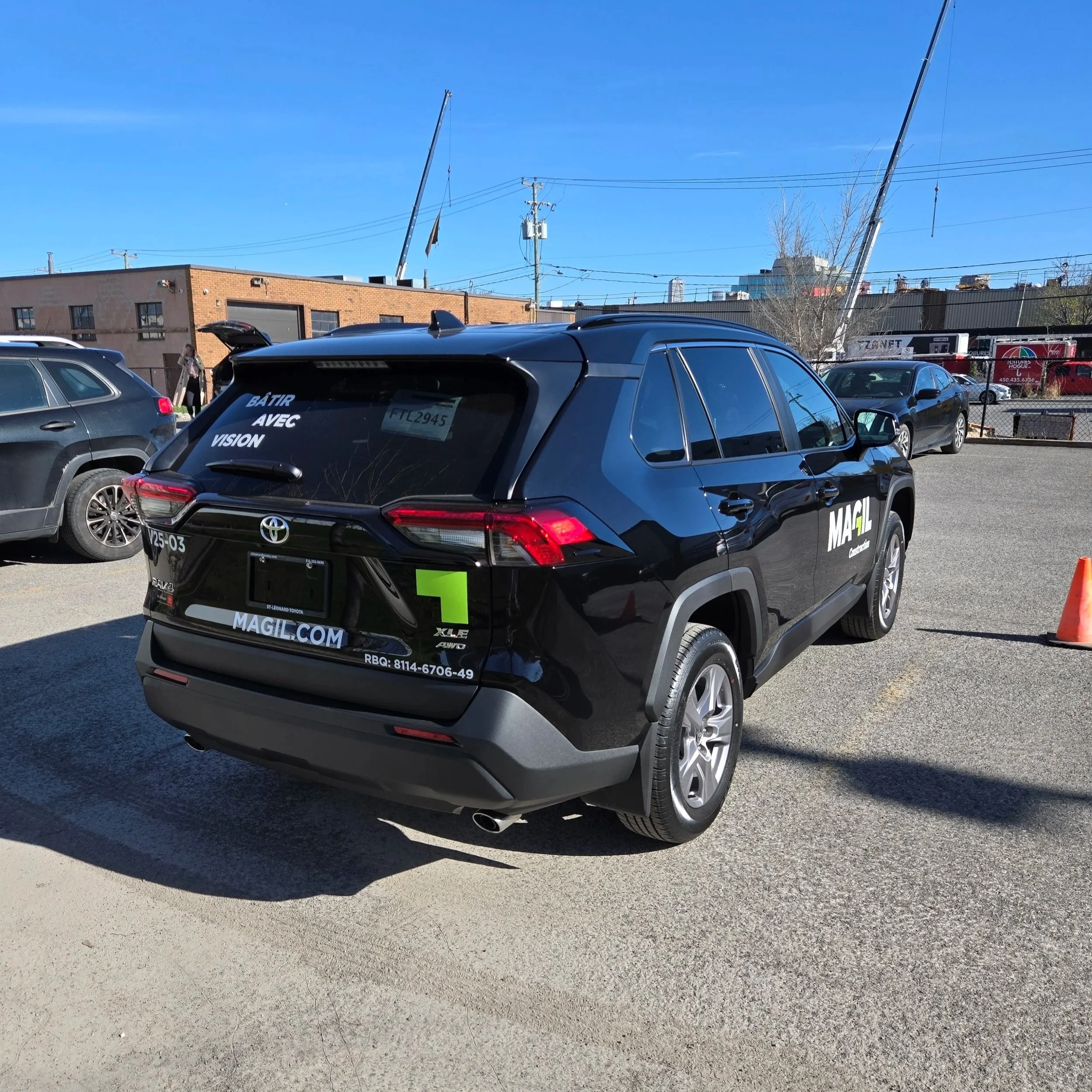
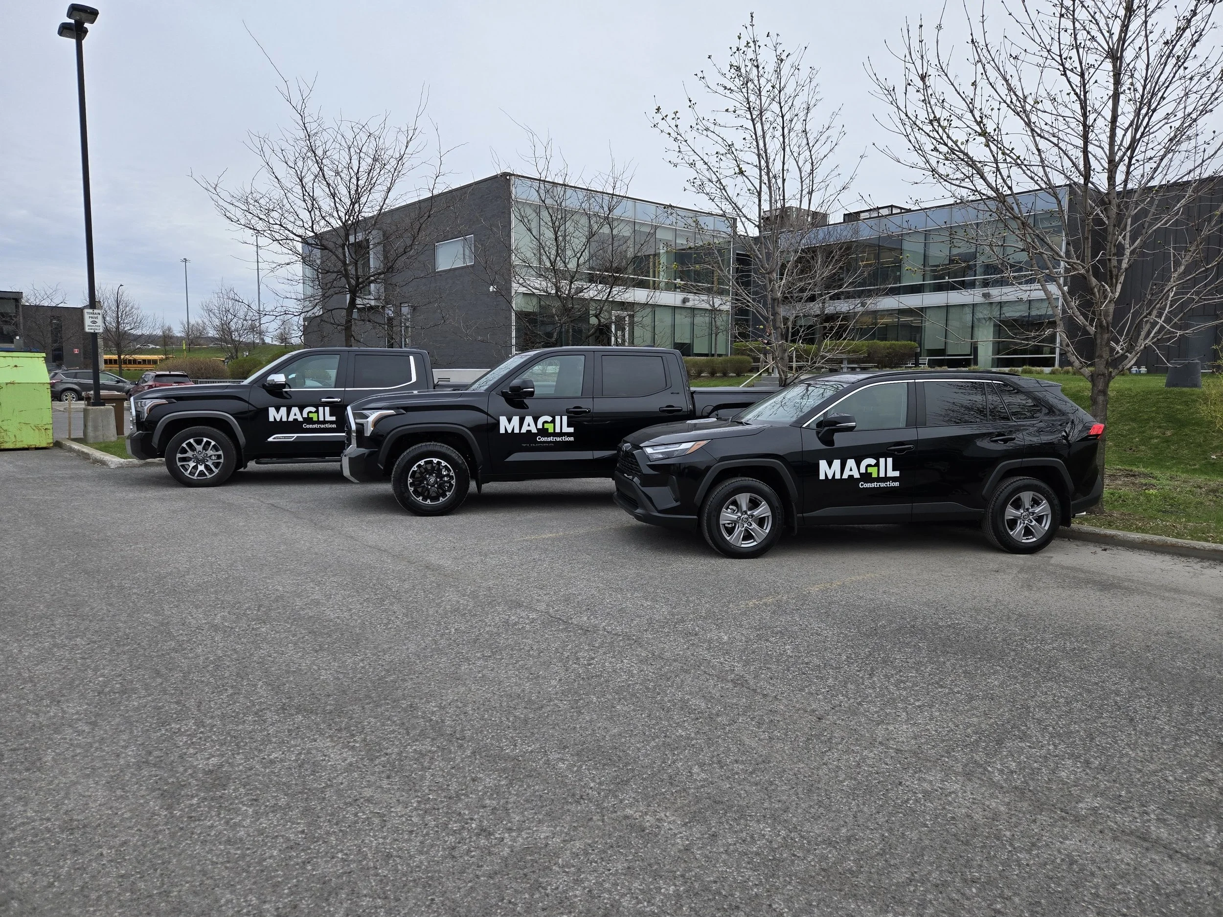
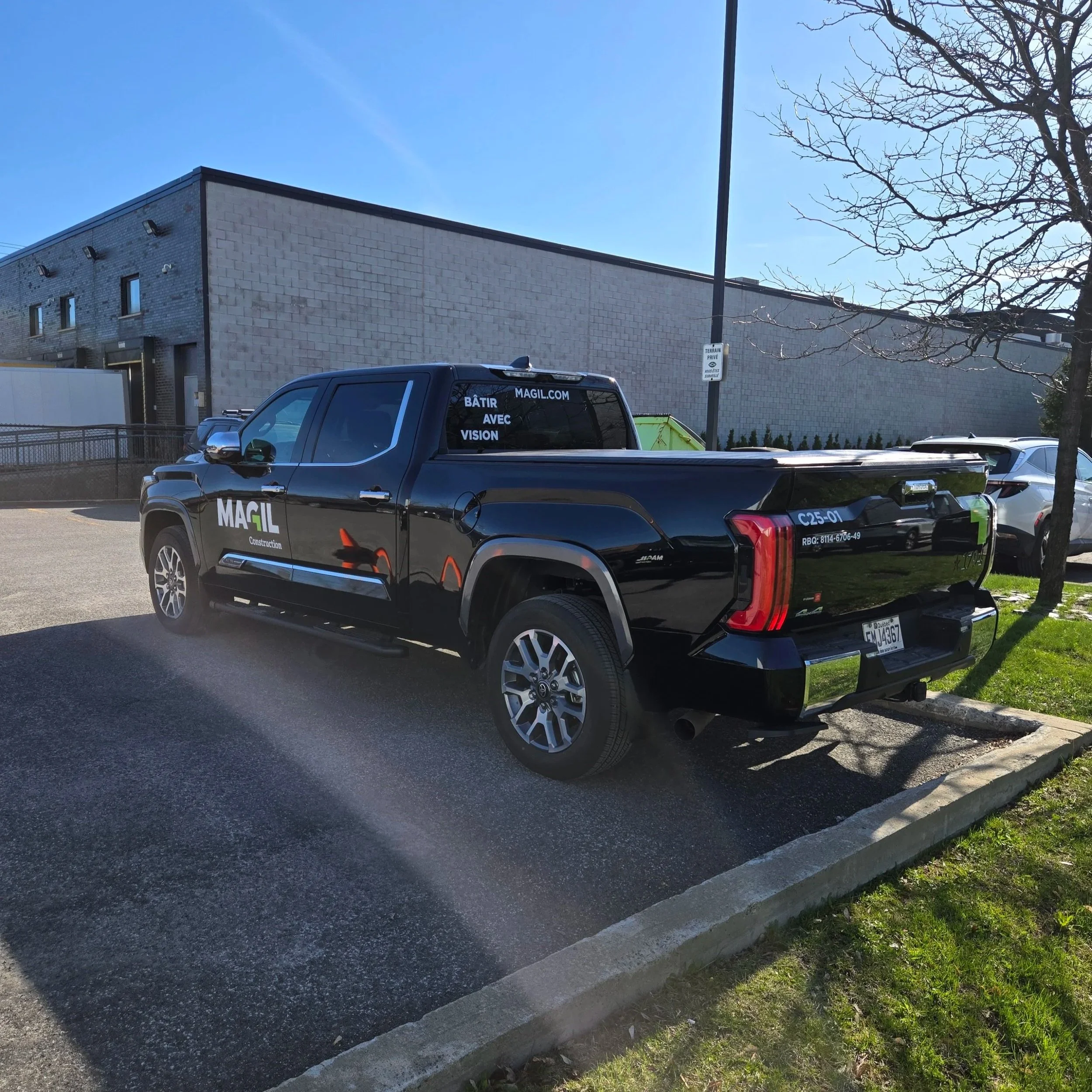
Minimalist Side Profiles: I restricted the sides of the vehicles and containers to primary logo placement. This maximizes "breathing room," ensuring the Magil identity is the hero of the composition.
Functional Rear Layout: By strategically moving primary contact details and secondary information to the rear of the vehicles, we kept the side profiles uncluttered. This approach ensures the brand is instantly recognizable at a glance, while essential details are perfectly positioned for drivers following in traffic.
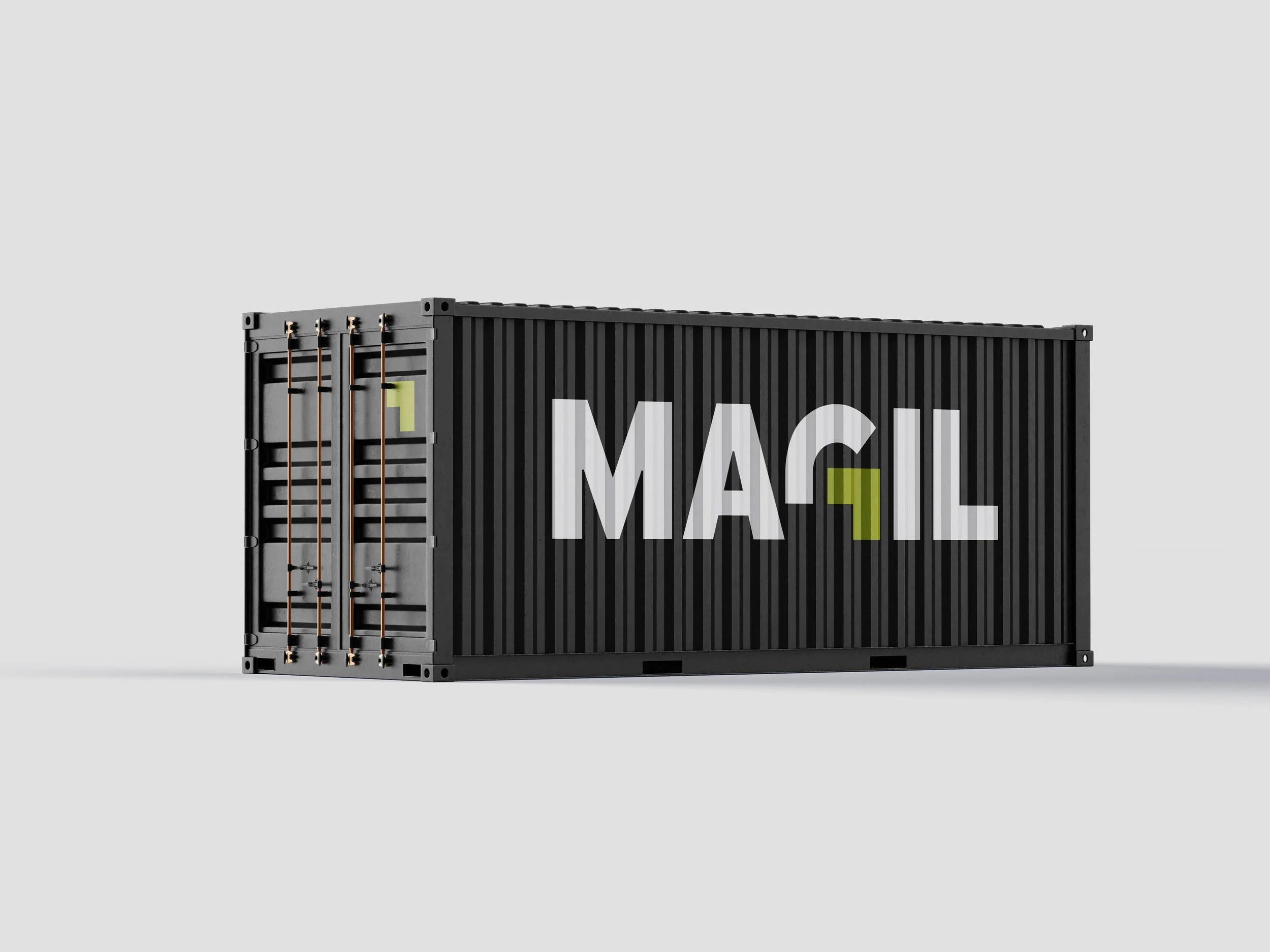
Scalable Industrial Graphics: For the 36" x 162" shipping container graphics, the design was adapted to maintain legibility across the deep ridges of the steel. This turns a functional storage unit into a high-impact, stationary billboard for every active job site.
Visual Longevity: I focused on high-contrast and color placement to ensure the branding remains timeless, professional, and rugged enough for industrial environments.