
The Objective
To design a premium, sophisticated holiday greeting card with the theme of "The Great Gatsby" for the year 2025 that celebrates the festive season while adhering subtly to the corporate branding.
The Creative Solution
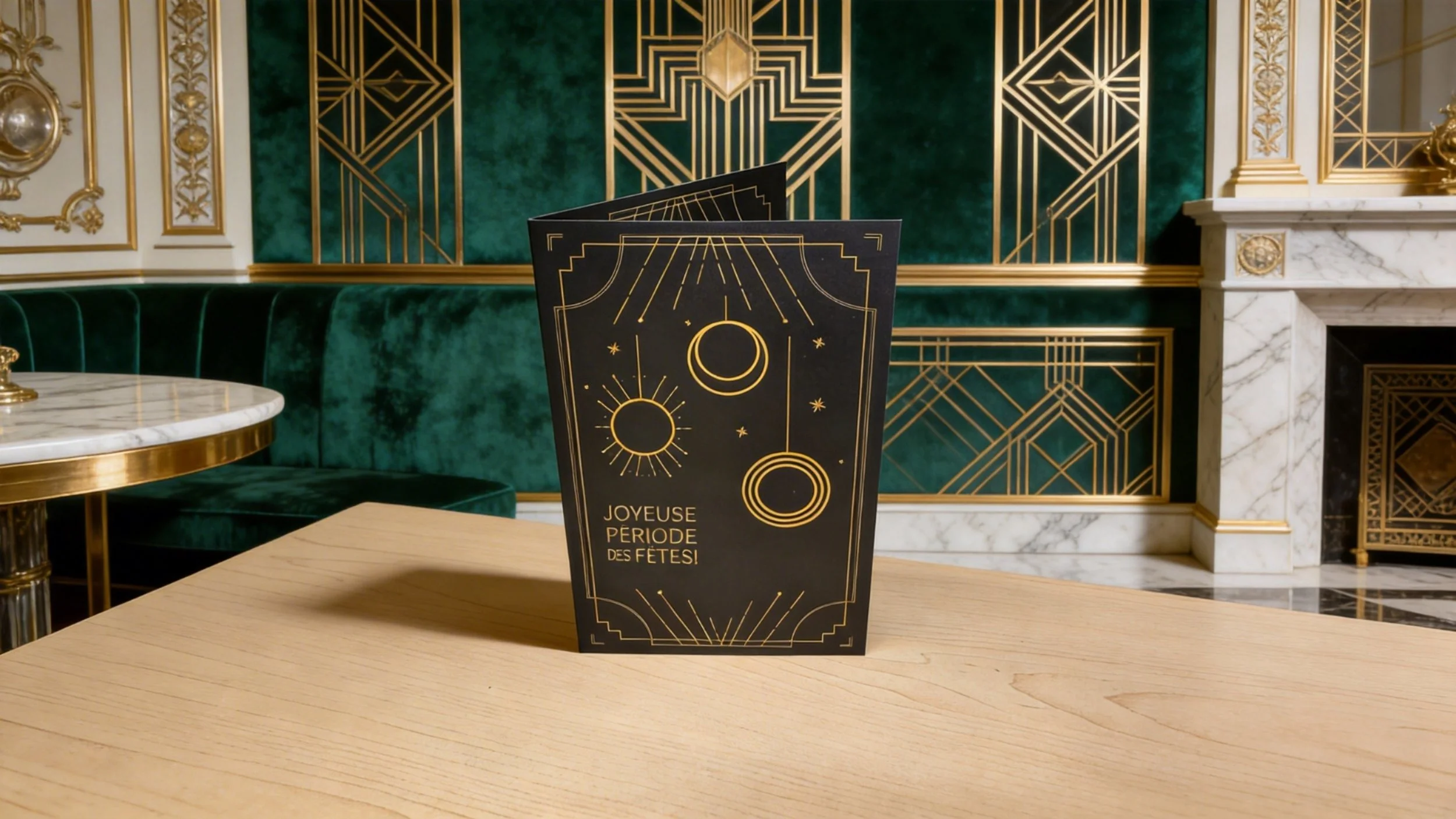
The card utilizes a deep, matte background to provide a modern feel while evoking the richness of a 1920s setting while integrating subtle application of brand elements.
Intent: A premium, themed greeting for clients and partners to mark the 2025 milestone.
Strategy: Leaning into the "Great Gatsby" aesthetic while maintaining strict brand discipline.
Detail: I integrated the Magil green chevron into the Art Deco corner motifs—a "hidden in plain sight" brand element that preserved the luxury feel without looking like a standard corporate ad.
While the holiday card served as a high-level external touchpoint, the brand’s voice needed to be equally resonant internally. I adapted this same commitment to brand integrity for a more grounded, worker-centric initiative.
Section 2: The Internal Perspective (Site-Staff Appreciation)
Magil Construction,
Corporate Stationery &
Seasonal Engagement
Maintaining brand integrity through diverse stakeholder touchpoints.
Section 1: The High-End Stakeholder Experience (Gatsby 2025)
The Objective
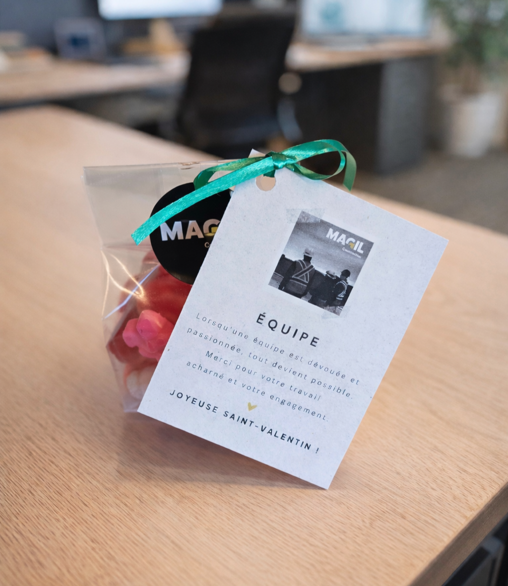
To design an internal appreciation gift for Magil Construction field workers and site staff. The goal was to ensure that the hardworking teams on active job sites felt seen and valued, using a visual language that felt authentic to the construction industry rather than a traditional holiday aesthetic.
The Creative Solution
I pivoted away from typical Valentine’s Day tropes (heavy reds and hearts) in favor of a Brand-First approach. By maintaining the corporate identity, the gesture felt like an official, professional salute to their hard work rather than a generic seasonal gift.
Intent: Ensuring field workers on active construction sites felt seen and appreciated.
Strategy: Moving away from typical Valentine’s Day palettes (reds/pinks) to stay authentic to the job site.
Detail: Using monochrome site photography and the signature corporate green ribbon ensured the gift felt like an official "salute" from the company. It prioritized professional pride over seasonal clichés.